
My personal website: A technical deep dive
In my previous post, I introduced the latest version of my personal website (the one you’re looking at now.) In the past, changes to my web page were iterative, but this time I wanted to start from scratch. New beginnings; infinite possibilities. Let’s dive into how this site was built!
A blank slate
When I started this project, I had a few goals in mind and some ideas of what I wanted the end result to look like. I wanted a handful of pages with varying content, beautiful cards for my online resume, and a blog where I could publish writings. Most importantly though, I also wanted this project to be a learning opportunity. I’d always relied on at the very least a CSS framework like Bootstrap or other preexisting libraries*.
This time, as a challenge for myself, I aimed to use nothing external. Only HTML, CSS, and perhaps a scripting language to help generate some files. For the most part I did achieve that, and I’m very happy with my end result! But it didn’t all go as planned.
*There is nothing wrong with avoiding reinventing the wheel, and it’s often the preferable option, especially if you’re not intentionally looking for the learning experience that comes from a more DIY solution.
Generating worlds
You know how I said, about five seconds ago, how I didn’t want to use any external libraries? Well that didn’t last long at all. I knew from the start that I wanted to write my blog posts in Markdown for simplicity and portability, but that meant converting it to HTML. So the first thing I worked on was a Markdown-to-HTML conversion script.
I quickly had some of the basics working (e.g. if a line starts with #<space>, replace the entire line with <h1>{line.replace('# ', '')}</h1>), but then I got to text formatting… What if bold text runs over two different lines? What if there’s a combination of bold and italics? What if the asterisk is actually part of a word and not meant to be a bold symbol at all? In terms of parsing, it seemed there were more exceptions than rules and while I ended up implementing a good chunk of it and learned a lot (I truly did), I eventually decided that it just didn’t make sense to reimplement such a complex parser if I could simply import markdown.
What initially started as a Markdown parser over a hundred lines long suddenly condensed into five:
import markdown
md = markdown.Markdown(extensions=['meta', 'extra', 'smarty'])

with open(input_filename, 'r', encoding='utf-8') as f:
    text = f.read()
    html = md.convert(text)
That out of the way, I also knew I wanted at least basic templating to avoid doing some rather ugly string interpolation. That, I didn’t want to have to reimplement. Reimplementing templating is not something that I find satisfying enough to attempt. I instead used a templating engine called Jinja (which I knew from prior experience with it). The features I was mostly interested in were includes, variables, and loops.
For those unfamiliar with the Jinja syntax, here is the entire source code of my blog/ index page as an example:
{% include "_prefix.html" %}
<main>
  <div id="main-content">
    {{ md_html }}

    {% with posts = pages_meta %}
      {% include "_blog-list.html" %}
    {% endwith %}
  </div>
</main>
{% include "_suffix.html" %}
I also created functions to generate a sitemap, an RSS feed, and an Atom feed. All in all, my generator script is just about 150 lines long (at the time of writing), which you can view here.
So now I have a handful of generated HTML files, but without any styling it doesn’t look so sharp. Let’s fix that!
 The now/ page without any styling.
Let there be colour!
As mentioned earlier, I typically use Bootstrap to help structure my websites and then style on top of it (a little fun fact is that XIV ToDo, which I created, also uses Bootstrap!) One of the problems with a CSS framework is that it can be difficult to get away from the “default” look it gives you out of the box. This time, I wanted to try creating something entirely different from scratch.
The way I approached it was to start with the bigger objects, and make my way down from there. I started with the main containers (the header, navigation bar, the content box, the footer) and sized them properly. At that point I also decided on some initial colors and fonts. From there, I moved on to smaller and smaller details. Any helpers that I needed (like text-muted or me-1) I would just create on the fly as I needed them (instead of mass-producing them beforehand).
To future-proof the colors and keep things tidy, I maintained variables that I reused throughout the style sheet instead of hardcoding values. This also means that if I add an eventual dark mode, I only need to override a handful of variables.
:root {
  --background-color: #f6f8fc;
  --background-off-color: #f4f6fb80;
  --main-background-color: #ffffff;
  --borders-color: #d1d7e4;

  --text-color: #282829;
  --text-muted-color: #6a6c72;
  --header-color: #2a7dd5;
  --link-color: #2a7dd5;

  . . .
  . . .
}
In terms of responsiveness, I heavily leveraged media queries. In general, this boiled down to reducing margins and paddings and removing border radius for smaller devices. Media queries allow you to override properties based on aspects like the screen size.
@media (min-width: 576px) and (max-width: 768px) {
  body {
    padding: 10px 30px;
  }
}
For the icons, I leveraged my trusty Font Awesome Pro lifetime licence (one of my favourite Kickstarter purchases). For those on a budget, they do have a free tier with over 2,000 icons available. I am absolutely not sponsored; I just really like their offerings.
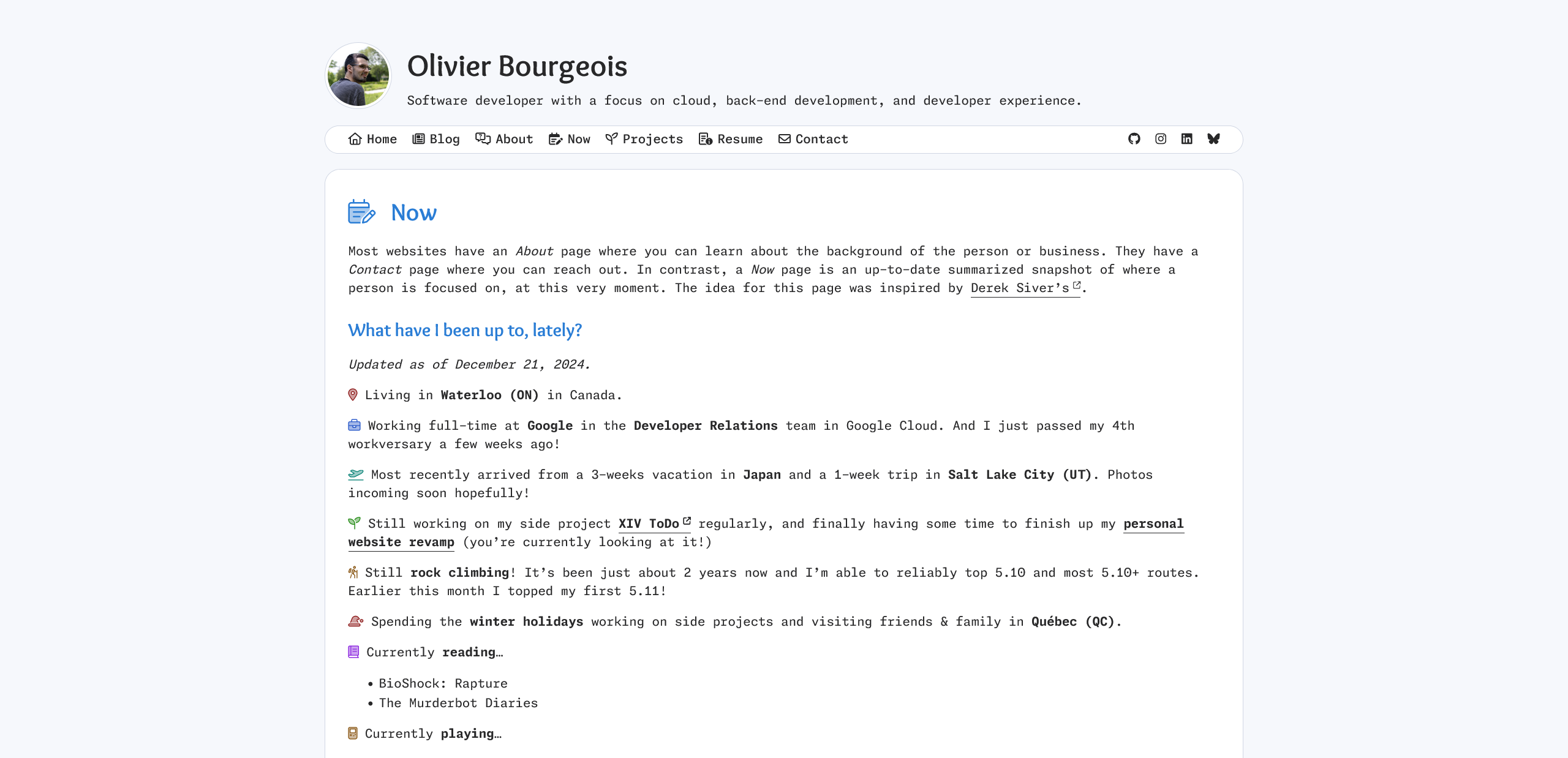 The now/ page with styling.
I have to say that even as I write this blog post, I’m still tweaking the styling ever so slightly. So it’s always a work in progress, and that’s okay!
The invisible host
Finally, I now need to host my website somewhere. Since previous versions of my website were already using GitHub Pages (and it has been working great for me), I decided to leave it as-is. The only change I needed to make was adding a GitHub workflow to run the page generator whenever new changes were pushed to the repository and create a gh-pages branch with its output.
name: Deploy to GitHub Pages
on:
  push:
    branches:
      - main
jobs:
  gh-pages-deploy:
    . . .
    . . .
      - name: Build and deploy to gh-pages
        run: |
          git checkout --orphan gh-pages-test
          chmod +x make.sh md2html.py
          ./make.sh
          git --work-tree out add --all
          git --work-tree out commit -m "Automated out build"
          git push origin HEAD:gh-pages --force
One common complaint of GitHub Pages is the lack of access to the routing server. This means you can’t modify the behaviour of routing to, for example, remove the .html suffix in the URL of non-index pages. There are a few methods to get around this like simply removing the extension from the file entirely. I feel strangely about extension-less files, so I instead opted to create subdirectories for each page. In short, it means that a page like /now/ would be served by /now/index.html.
for file in out/*.html
do
    filename=$(basename "$file" .html)

    if [ "$filename" = "index" ]; then
        continue
    fi

    mkdir -p "out/$filename"
    mv "$file" "out/$filename/index.html"
done
I then made sure my domain name (olivi-eh.dev) was linked to the GitHub Pages configuration, and I was good to go! If you want to see the entire source code for this website, it’s available in a public repository on GitHub. I’m hoping this inspires others to also attempt the challenge of building something!