Monospace: Why use fixed-width fonts in the modern world
If you have ever used a computer, you likely have come across fonts before (like the classic Times New Roman or the infamous Comic Sans). But did you know fonts have been around for much longer than computers have? The concept of fonts dates from the 15th century, shortly after the invention of the printing press.
Originally, fonts came in sets of individual physical molded letters made of cast iron (the French word for cast iron is… Fonte!) These metal pieces would then be placed on trays or railings to form words and sentences. The letters would then be inked, ready to be used as a sort of giangantic stamp for everything from newspapers to books.
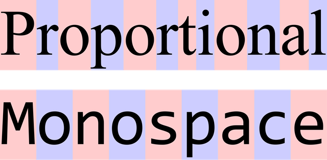
Fonts differ by various characteristics: casing, boldness, ink traps, spacing, ligatures, kerning, and much more. Among these characteristics is whether the font’s letters are of variable width (proportional to each letter) or of fixed width (equal width regardless of letter). The latter is called a fixed width font or a monospace font.
 Comparison between variable width fonts and fixed width fonts. Wikipedia
Small disclaimer: the tables I created in this post to do comparisons don’t show up nicely on mobile. It may be preferable to view this post in landscape mode, or on a tablet or computer.
For code readability
All* computer programmers use monospace fonts to write their code, where a mistake on one small character can make a whole lot of difference in the program output. Monospace fonts are generally designed to take out any ambiguity between similar-looking characters. Take a look at the following sets of characters and try to spot where ambiguity could occur.
| Proportional | Monospace |
|---|---|
| 0 / O / o 1 / l / I cl / d rn / m |
0 / O / o 1 / l / I cl / d rn / m |
Additionally, monospace fonts make code appear less squished and more structured making it easier to parse.
| Proportional | Monospace |
|---|---|
| if __name__ == '__main__': pages_meta = process_notes() generate_sitemap(pages_meta) generate_rss(pages_meta) generate_atom(pages_meta) |
if __name__ == '__main__': pages_meta = process_notes() generate_sitemap(pages_meta) generate_rss(pages_meta) generate_atom(pages_meta) |
*Do you write code and use a proportional font? Please reach out to me, I would love to hear about it!
For making art
Interestingly enough, monospace fonts also have use in the creation of arts. Take the tablature for the first few iconic guitar notes of Smoke on the Water by Deep Purple. Which type of font do you think is more readable for a guitar player learning a new song?
| Proportional | Monospace |
|---|---|
| e|‐‐‐‐‐‐‐‐‐‐‐‐‐‐‐‐|‐‐‐‐‐‐‐‐‐‐‐‐‐‐‐‐| B|‐‐‐‐‐‐‐‐‐‐‐‐‐‐‐‐|‐‐‐‐‐‐‐‐‐‐‐‐‐‐‐‐| G|‐‐‐‐‐3‐‐‐5‐‐‐‐‐‐|‐‐‐3‐‐‐6‐5‐‐‐‐‐‐| D|‐5‐‐‐3‐‐‐5‐‐‐‐5‐|‐‐‐3‐‐‐6‐5‐‐‐‐‐‐| A|‐5‐‐‐‐‐‐‐‐‐‐‐‐5‐|‐‐‐‐‐‐‐‐‐‐‐‐‐‐‐‐| E|‐‐‐‐‐‐‐‐‐‐‐‐‐‐‐‐|‐‐‐‐‐‐‐‐‐‐‐‐‐‐‐‐| |
e|‐‐‐‐‐‐‐‐‐‐‐‐‐‐‐‐|‐‐‐‐‐‐‐‐‐‐‐‐‐‐‐‐| B|‐‐‐‐‐‐‐‐‐‐‐‐‐‐‐‐|‐‐‐‐‐‐‐‐‐‐‐‐‐‐‐‐| G|‐‐‐‐‐3‐‐‐5‐‐‐‐‐‐|‐‐‐3‐‐‐6‐5‐‐‐‐‐‐| D|‐5‐‐‐3‐‐‐5‐‐‐‐5‐|‐‐‐3‐‐‐6‐5‐‐‐‐‐‐| A|‐5‐‐‐‐‐‐‐‐‐‐‐‐5‐|‐‐‐‐‐‐‐‐‐‐‐‐‐‐‐‐| E|‐‐‐‐‐‐‐‐‐‐‐‐‐‐‐‐|‐‐‐‐‐‐‐‐‐‐‐‐‐‐‐‐| |
Monospace can also be used for a graphic design technique called ASCII art (named so for its constrained usage of the 95 printable characters contained in the American Standard Code for Information Interchange). Monospace fonts allow the art to have a deterministic and grid-like look of characters. Below is one of many examples you can find on the ASCII Art Archive.
Art by Joan G. Stark

         wWWWw               wWWWw
   vVVVv (___) wWWWw         (___)  vVVVv
   (___)  ~Y~  (___)  vVVVv   ~Y~   (___)
    ~Y~   \|    ~Y~   (___)    |/    ~Y~
    \|   \ |/   \| /  \~Y~/   \|    \ |/
   \\|// \\|// \\|/// \\|//  \\|// \\\|///
jgs^^^^^^^^^^^^^^^^^^^^^^^^^^^^^^^^^^^^^^^^
For computing numbers
In fields of science and mathematics (including adjacent fields like economics and finances), monospace fonts prevent the misalignment of numbers, which reduces the rate of mistakes and speeds up readability of numbers. Proportional fonts have the downside of quickly misaligning large numbers (especially when they contain lots of 1’s which have a narrow width).
| Proportional | Monospace |
|---|---|
| 36,000 +111,107 -------- 147,107 |
36,000 +111,107 -------- 147,107 |
In biochemistry, monospace fonts are useful to quickly parse nucleic acid sequences, making pairs align together in a deterministic manner. Below is one such example (don’t read too much into it, it doesn’t map to anything).
| Proportional | Monospace |
|---|---|
| TCCTGATACCGTATTC GAATAAGCCGAAGCTG ATGCGTAGCTAGCTAG |
TCCTGATACCGTATTC GAATAAGCCGAAGCTG ATGCGTAGCTAGCTAG |
Or just because it looks nice!
Finally you may simply find, like me, that monospace fonts are aesthetically pleasing, and that’s very valid! Regardless of the domain, you can see that still today, monospace fonts have tons of room to shine.
What about you? Do you use monospace in your day-to-day life? Do you have a favourite monospace font?*
*These days, I tend to keep coming back to a series of fonts called Monaspace.
