
Decade of flights: Visualisation from ten years of data
I took my first flight on June 1, 2015 at the age of 20*. Now well into June 2025, I wanted to look back on the past 10 years and see what kind of statistics I could get out of it. Please make sure your seat and tray table are in the upright position for take-off!
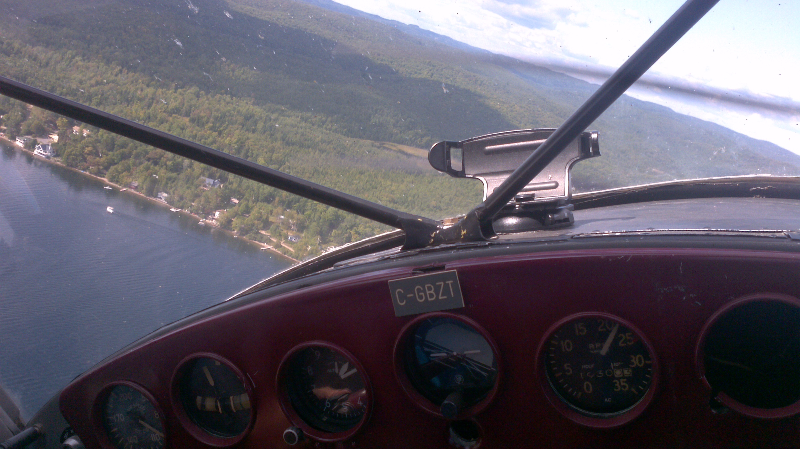 Photo I took mid-flight aboard a Cessna 140.
*Well okay… That’s not exactly true. In late-2012 I stepped aboard an old Cessna 140 held together by duct tape and fairy dust about an hour north of Quebec City, and in the summer of 2014 I hung out in the back of a Cessna 182 and climbed up 10,000 feet before jumping out of it. But my first commercial flight was in 2015 so let’s run with that.
Historical flight data
As I’ve mentioned in my blog post about Obsidian, I take note of a lot of things. This includes flights that I’ve taken. I had on hand a complete list of flights that I’ve taken in the past, but I realized that it only contained flight numbers and dates, and nothing else. Surely the rest of the data should be available online somewhere, right?
It didn’t take me long to realize that historical flight data was extremely difficult to get a hold of. Despite looking for quite some time, I wasn’t able to find flight data older than 3 days that wasn’t locked behind some membership-only service or a paid subscription. I ended up shelling out $25 to get access to the simple data I was looking for (departure and arrival times – expected and actual – and aircraft).
From there, I built a short Python script to intake my flight data and output stats and graphs. Full disclosure, I am not a stats or data vis person, but I did my best!
Preliminary results
Using the aforementioned script, I computed a handful of interesting statistics out of the 76 flights I’ve taken over the past decade. Here they are:
- Total number of flights: 76
- Unique cities visited: 32
- Unique airports visited: 35
- Unique airlines flown: 11
- Total distance flown: 15,6240 km
- Total duration flown: 244 hours and 15 minutes
- Mean duration per flight: 3 hours and 12 minutes
- Mean distance per flight: 2,055 km
- Shortest distance: 165 km
- Longest distance: 10,370 km
- Shortest duration: 44 minutes
- Longest duration: 13 hours and 38 minutes
Who knew that I would’ve spent just shy of 250 hours over the past decade stuck in airplanes! I don’t think I want to know how many hours I’ve spent in the airports waiting for said flights, though.
When do I travel?
Immediately, the first thing that comes to mind in the following chart is that the global pandemic of 2020 really put a pause in my own travels. I did not fly at all in either 2020 or 2021, and only by necessity during 2022 and 2023. In fact, I’m still not up to par with the amount of flying I used to do pre-2020.
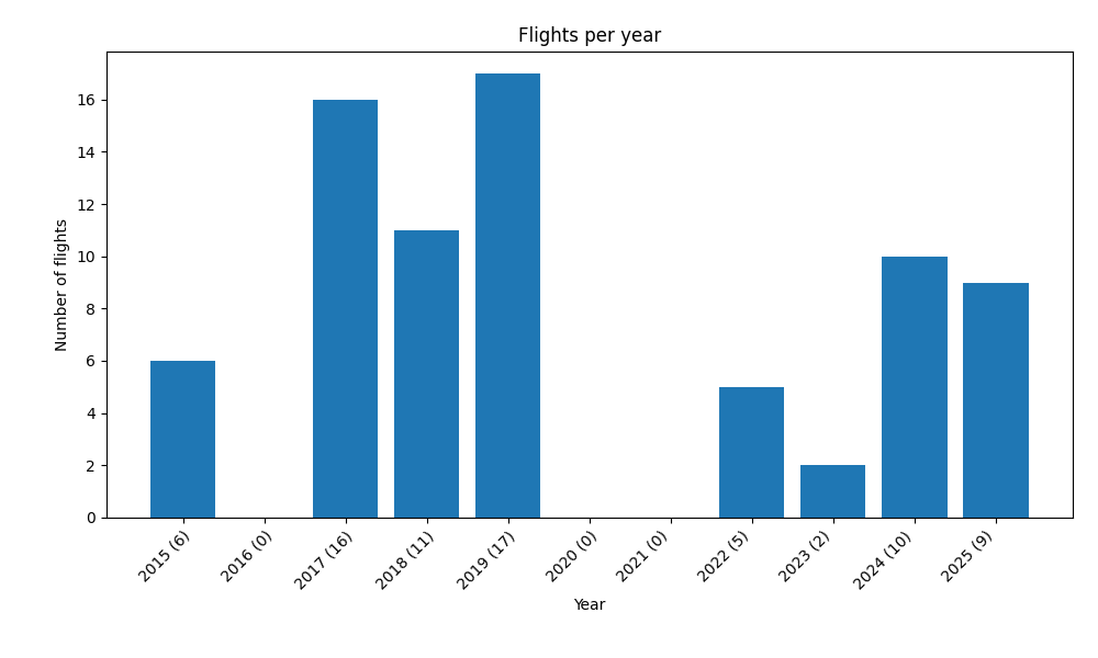 Chart showcasing the # of flights per year.
It’s also fairly noticeable that I don’t travel during the winter, in general. Most of my trips end up in the shoulder seasons (either May-June, or September-October).
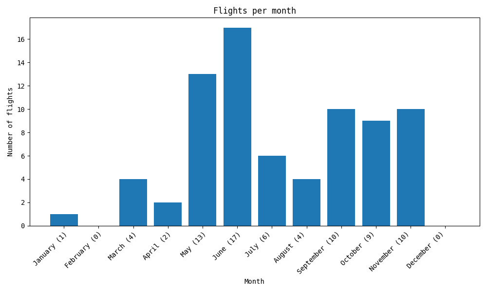 Chart showcasing the # of flights per month.
Where do I travel?
I’ve lived most of my life on the east coast of Canada, which is a fairly sparsely populated area. This means that most of my flights had connections through Toronto or Montreal. It also means that a lot of these flights started or ended in Moncton, which was the city near where I grew up.
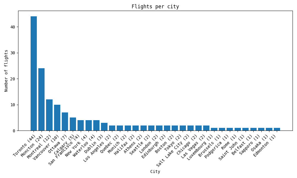 Chart showcasing the # of flights per city.
Consequently, the airports I’ve been in the most are also all Canadians (many of which have inflated numbers due to connections).
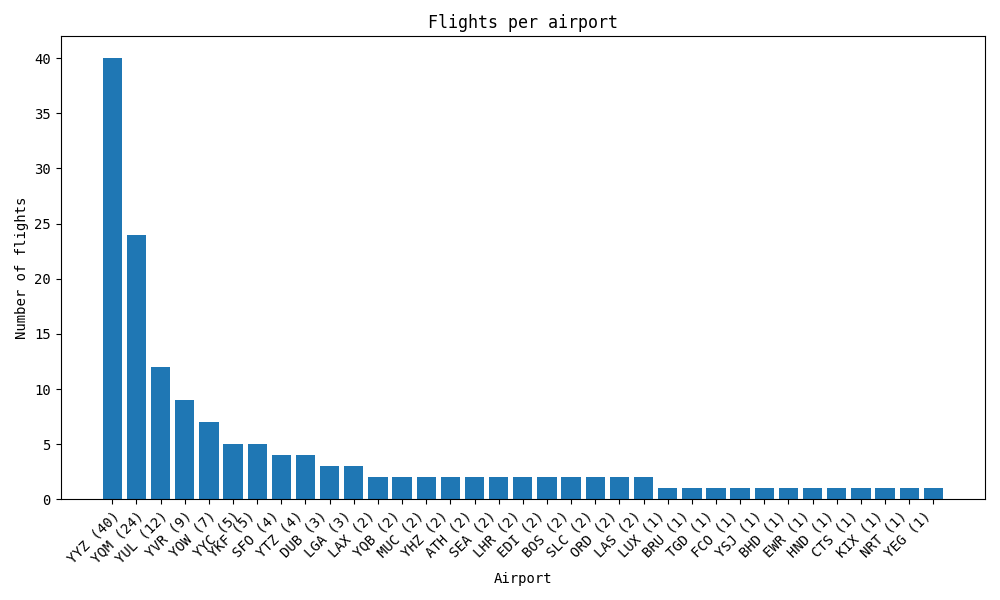 Chart showcasing the # of flights per airport.
Through which means do I travel?
This first chart is interesting. I thought for sure that the top aircraft used in my past flights would be a Boeing or an Airbus but hey, we do love that Bombardier representation!
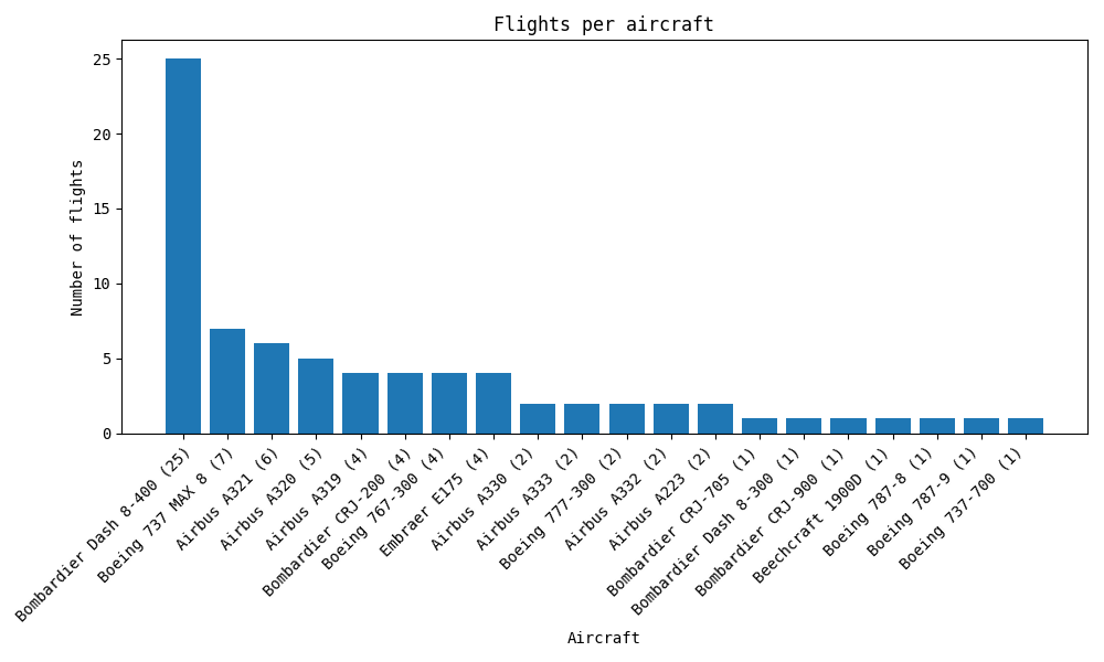 Chart showcasing the # of flights per aircraft.
And… Yeah I’m mostly an Air Canada guy. They often offer the best availability or prices for the locations I’m interested in, so most of my flights end up through them.
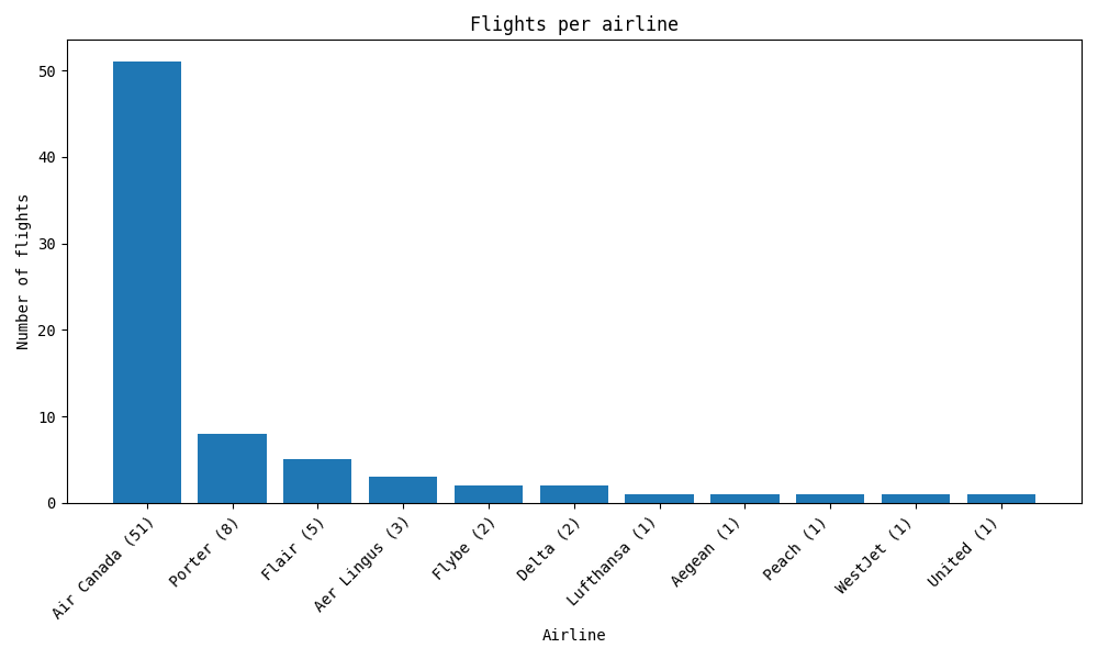 Chart showcasing the # of flights per airline.
What do the flights look like?
Lastly, I was also interested in seeing how flights themselves looked like, in a bit more detail (departures, arrivals, duration, delays).
I’m not an early bird, so I tend to prefer flights that depart after 9 or 10 in the morning, and that is clearly visible on the following chart, with the bulk of my flights departing between 11am and 3pm.
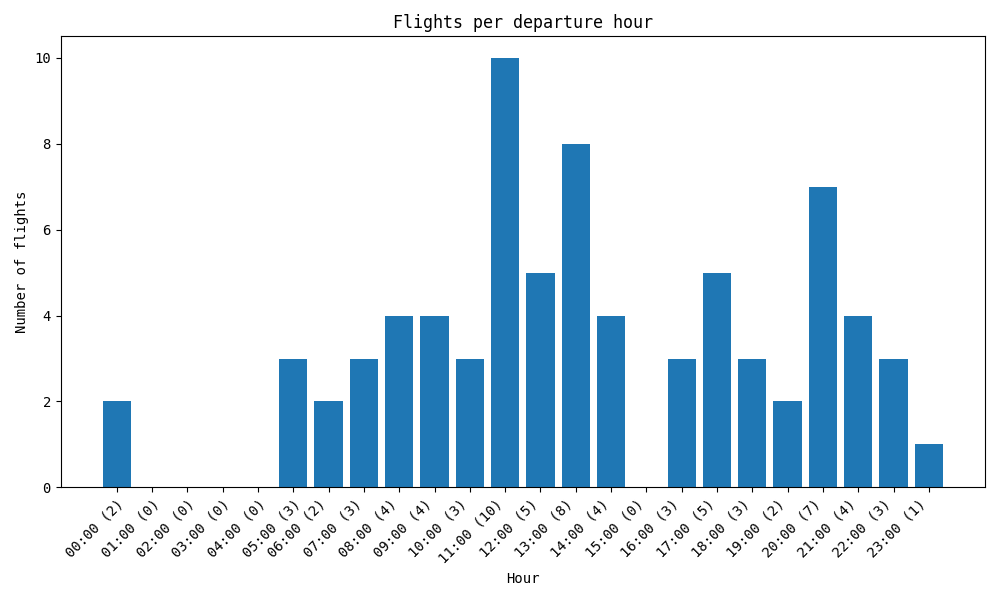 Chart showcasing the # of flights per departure hour.
As for arrival, the chart looks a bit more like a bell curve, peaking at 2pm, tapering off on both sides.
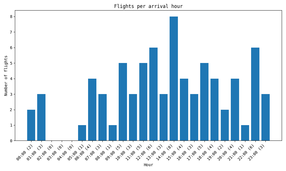 Chart showcasing the # of flights per arrival hour.
Immediately, it’s obvious that the majority of the flights I’ve taken are short-haul (with most being less than 3 hours long). The few exceptions at the tail-end are going to Europe pre-pandemic, or to Japan last year.
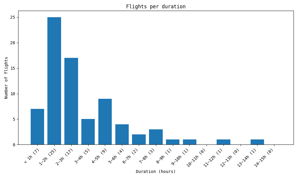 Chart showcasing the # of flights per duration.
Delays was an interesting metric to chart, because naively I think of myself as fairly unlucky when it comes to flying. It feels like most of my flights are delayed. But now that I have this chart in front of me, it’s undeniable that almost half of the flights I’ve taken in fact arrived earlier than expected. Of the delays, almost all were less than an hour.
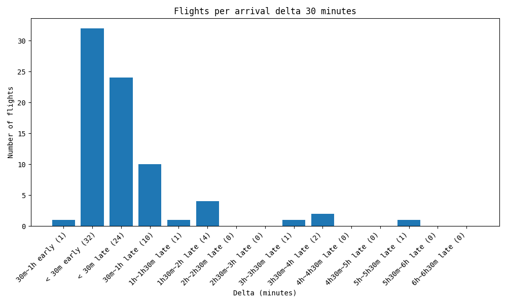 Chart showcasing the # of flights per arrival delta.
Future improvements
That’s it for now, but I’m thinking of perhaps doing another one of these every 5 years or so. There are a number of improvements I’d like to look at for next time, including:
- Better or nicer looking charts.
- Color-coding in the charts.
- Stats on how long I stay in airports.
- Break down the “per year” chart to visualise e.g. flights per continent.
- Add some scatterplots (e.g. distance vs. duration, distance vs. delays).
- See how day of the week or time departed correlates to delays.
- Differentiate reasons for flights (e.g. vacation, work).
- Add additional charts (e.g. flights per day of the week).
- Add heatmap or flight paths overlaid on a world map.
Think of anything else I could track? Interested in chatting about this in more depth? Let me know!